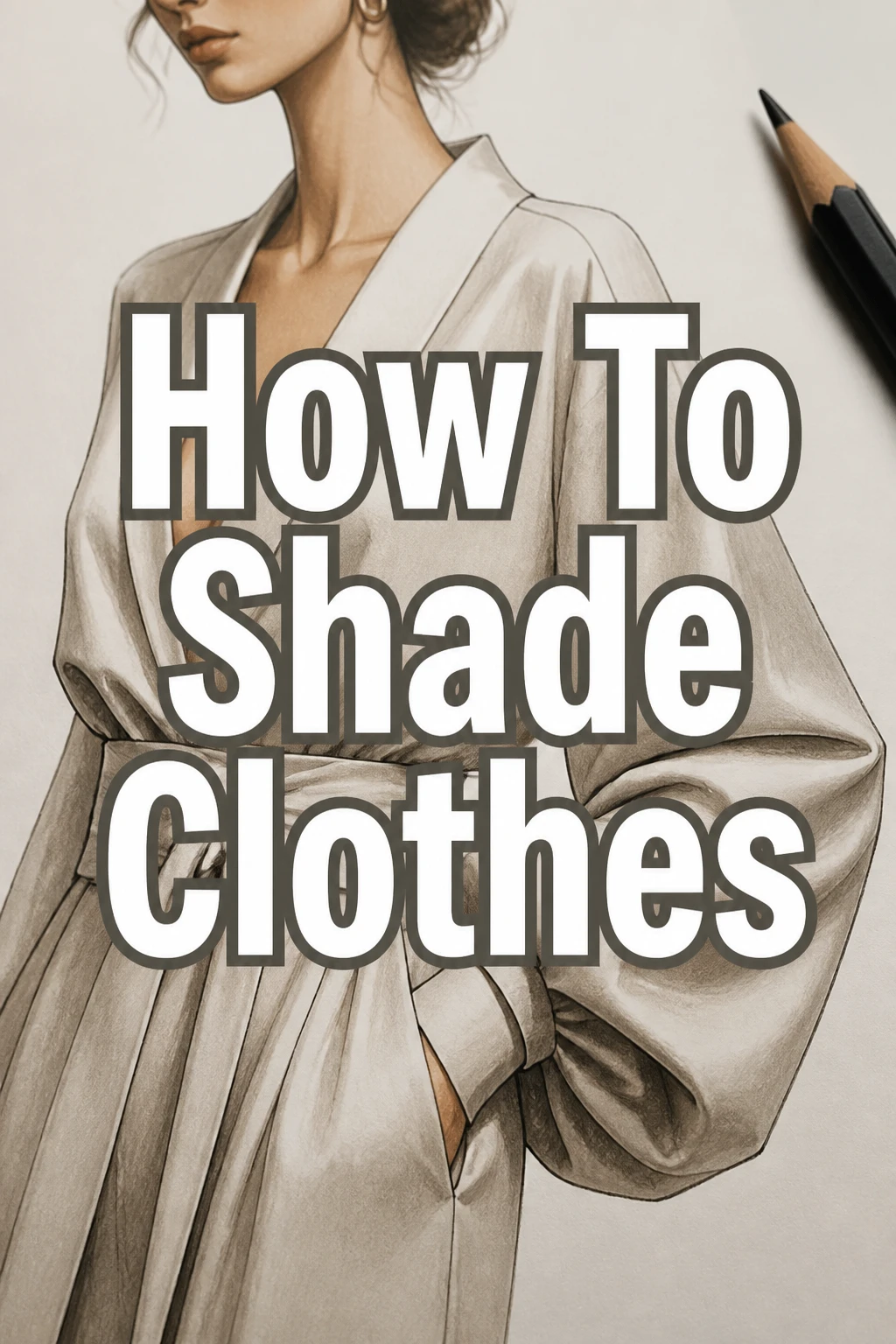
How To Shade Clothes
Drawing realistic clothes can transform a flat character into a dynamic one. I remember my early sketches looked stiff, with fabric that seemed painted on rather than draped. Learning how to shade properly was the game-changer for bringing my figures to life.
This guide will walk you through the practical steps I learned, helping you add depth and realism to your clothing illustrations. You’ll gain the confidence to make fabric look soft, crisp, or flowing.
Quick Overview
By the end of this guide, you’ll be able to confidently shade various types of clothing, understanding the interplay of light, form, and fabric. You’ll move beyond flat drawings to create garments with believable depth and texture.
- Time needed: 30-60 minutes for initial understanding and practice, ongoing for mastery
- Difficulty: Beginner
- What you’ll need: Sketching pencils (HB, 2B, 4B or similar), drawing paper, a kneaded eraser, and reference images of clothes.
Step-by-Step Instructions
Step 1: Understand Your Light Source
The very first step to effective shading is knowing where your light is coming from. Imagine a single lamp illuminating your subject. This will dictate where light hits and where shadows fall.
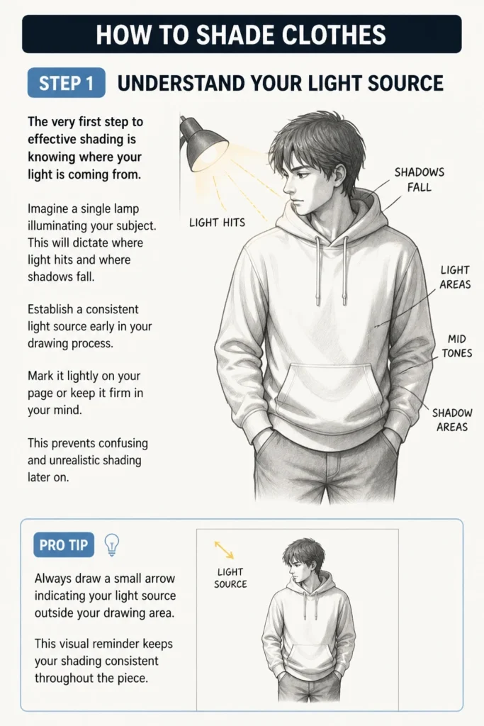
Establish a consistent light source early in your drawing process. Mark it lightly on your page or keep it firm in your mind. This prevents confusing and unrealistic shading later on.
Pro Tip: Always draw a small arrow indicating your light source outside your drawing area. This visual reminder keeps your shading consistent throughout the piece.
Step 2: Identify Basic Fabric Folds
Fabric folds aren’t random; they follow predictable patterns. Common types include pipe folds (cylindrical), zigzag folds (accordion-like), spiral folds (twisting), and half-lock folds (hanging over an edge). Your light source will interact differently with each.
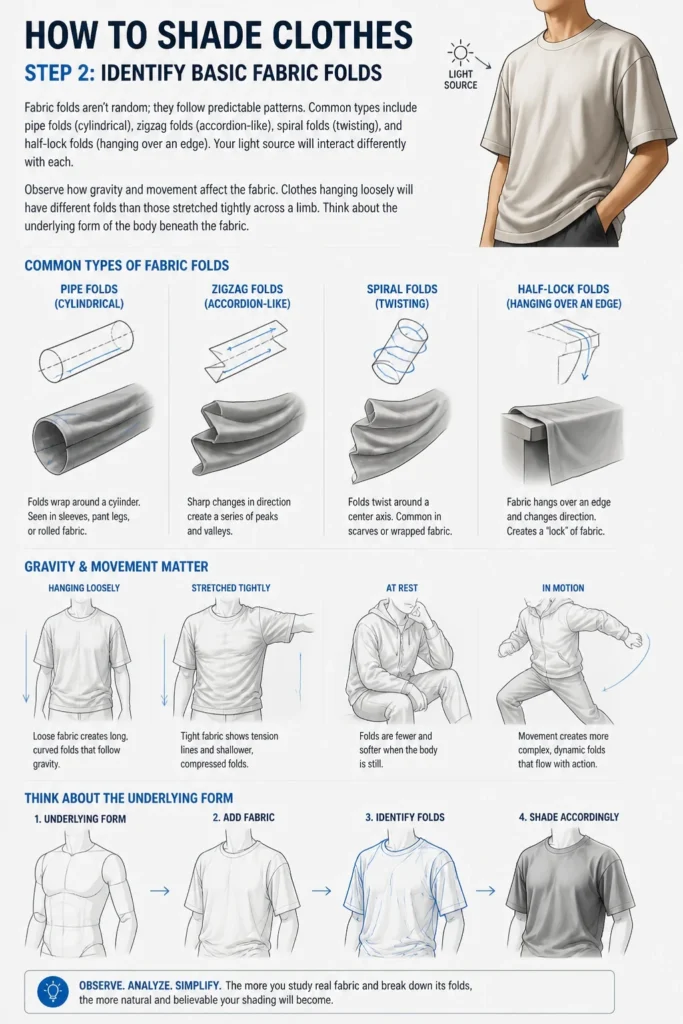
Observe how gravity and movement affect the fabric. Clothes hanging loosely will have different folds than those stretched tightly across a limb. Think about the underlying form of the body beneath the fabric.
Step 3: Map Out Light and Shadow Areas
With your light source established, mentally divide your fabric into areas that receive direct light, areas in shadow, and mid-tones. Use very light lines to block these out. Don’t add any dark shading yet.
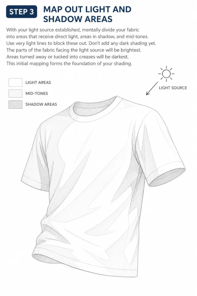
The parts of the fabric facing the light source will be brightest. Areas turned away or tucked into creases will be darkest. This initial mapping forms the foundation of your shading.
Step 4: Apply Base Shading
Begin to fill in the shadow areas with a light, even tone using a softer pencil (like a 2B). This isn’t your final dark shade, but a uniform base. Maintain consistency in your strokes.
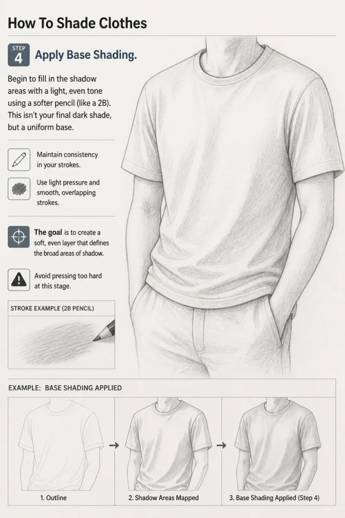
Use light pressure and smooth, overlapping strokes. The goal is to create a soft, even layer that defines the broad areas of shadow. Avoid pressing too hard at this stage.
Step 5: Build Up Mid-Tones and Form
Now, start building up the mid-tones, which are the transition areas between light and dark. Use slightly more pressure or a slightly darker pencil. This step helps define the curve and volume of the fabric.
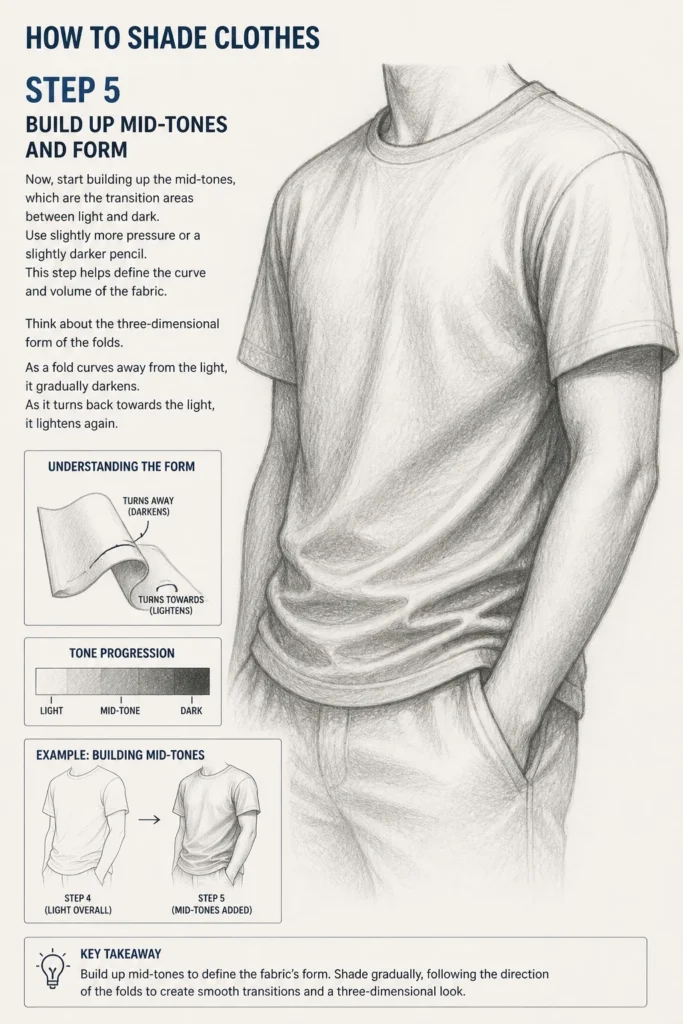
Think about the three-dimensional form of the folds. As a fold curves away from the light, it gradually darkens. As it turns back towards the light, it lightens again.
Step 6: Define Creases and Deep Shadows
Locate the deepest parts of the folds and creases. These are typically where the fabric bunches up or is most obscured from the light. Use a darker pencil (like a 4B or 6B) with more pressure.
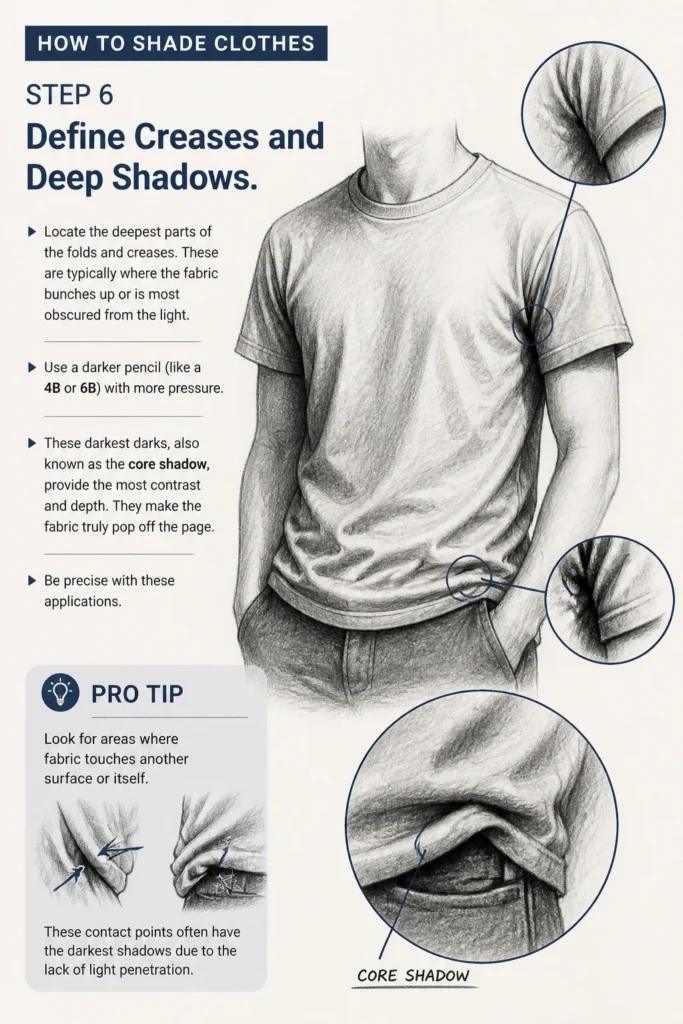
These darkest darks, also known as the “core shadow,” provide the most contrast and depth. They make the fabric truly pop off the page. Be precise with these applications.
Pro Tip: Look for areas where fabric touches another surface or itself. These contact points often have the darkest shadows due to the lack of light penetration.
Step 7: Add Highlights and Reflected Light
The brightest areas of the fabric are your highlights. Leave these areas untouched or use a kneaded eraser to lift pigment for crisp, sharp highlights. These are crucial for showing the fabric’s texture and sheen.
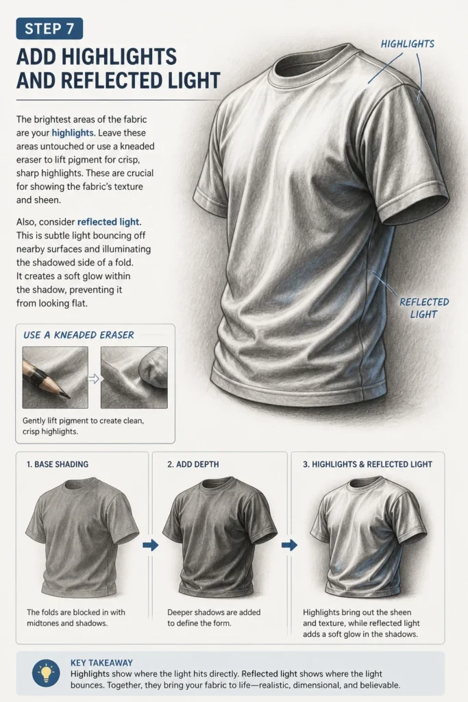
Also, consider reflected light. This is subtle light bouncing off nearby surfaces and illuminating the shadowed side of a fold. It creates a soft glow within the shadow, preventing it from looking flat.
Step 8: Refine and Blend
Once your main light, mid-tone, and shadow areas are established, blend them smoothly. Use a blending stump, tortillon, or even a clean finger for larger areas. Blend in the direction of the fabric’s form.
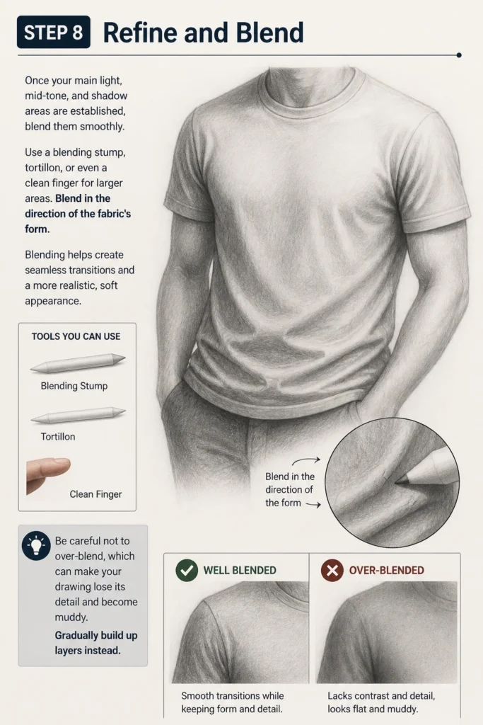
Blending helps create seamless transitions and a more realistic, soft appearance. Be careful not to over-blend, which can make your drawing lose its detail and become muddy. Gradually build up layers instead.
Step 9: Consider Fabric Texture
Different fabrics have different textures, and this affects how they reflect light and form shadows. A smooth silk will have sharp, bright highlights, while a rough wool will absorb more light and have softer, diffused highlights.
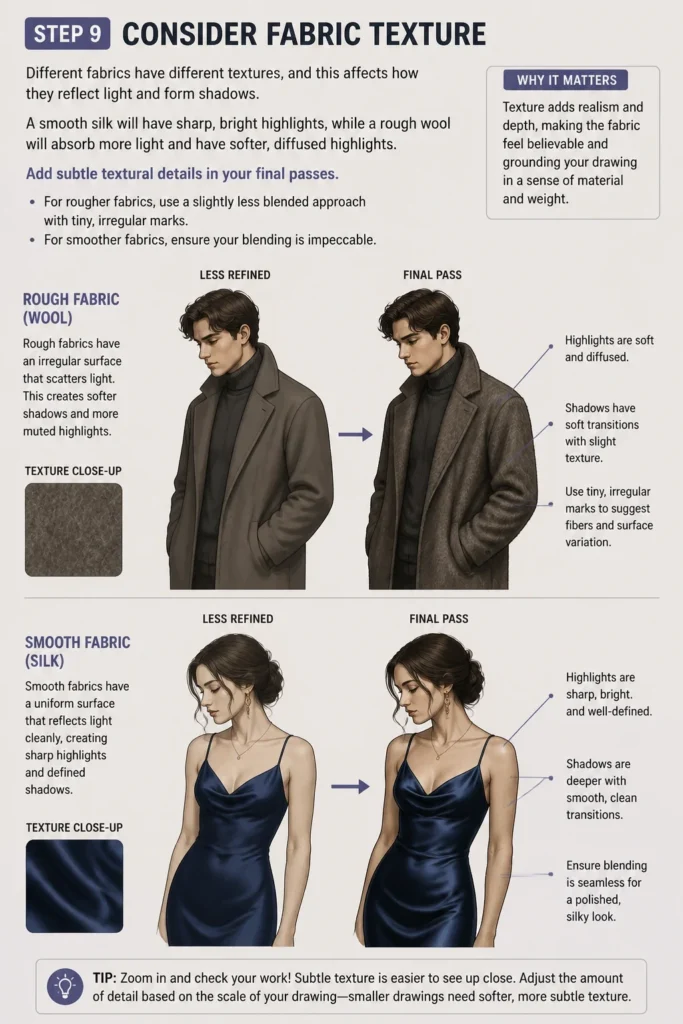
Add subtle textural details in your final passes. For rougher fabrics, use a slightly less blended approach with tiny, irregular marks. For smoother fabrics, ensure your blending is impeccable.
Common Mistakes to Avoid
Ignoring the Light Source
A common pitfall is to shade without a clear light source in mind. This results in arbitrary shadows that don’t make sense, making the clothing look jumbled and unrealistic. Always establish your light direction first, and refer to it constantly throughout your shading process to ensure consistency.
Shading Folds Uniformly
Treating all folds as identical is another mistake. Different parts of a garment will have varying tension and drape, creating unique fold patterns. Observe how fabric gathers, stretches, and hangs, and adapt your shading to reflect these distinct forms. Each fold tells a story about the garment’s interaction with the body and gravity.
Over-Blending
While blending is important for smooth transitions, excessive blending can erase crucial details and make your shading appear muddy or flat. It can remove the crispness of edges and the texture of the fabric. Focus on blending areas that need smooth gradients, but leave some distinct marks or edges to maintain visual interest and form.
Neglecting Fabric Type
Failing to consider the type of fabric can make your shading look generic. Cotton, silk, denim, and wool all behave differently under light. A heavy fabric will cast deeper, softer shadows, while a thin fabric might show more transparency or sharper, crinkled folds. Research or observe how various materials interact with light and integrate this into your shading.
Troubleshooting
My Shading Looks Flat
If your shaded clothes lack depth, it’s often due to insufficient contrast. You might not be pushing your darks dark enough, or your lights aren’t bright enough. Re-evaluate your core shadows and highlights. Ensure you have a full range of values from pure white to deep black in your drawing.
Another reason for flatness can be a lack of defined form. Go back to your basic fold identification. Are you clearly articulating the curves and planes of each fold? Use mid-tones to show how the fabric turns in three dimensions.
Folds Look Unnatural or Stiff
Unnatural folds usually stem from not understanding the underlying structure or the fabric’s behavior. Are you drawing folds randomly, or are they reacting to the body and gravity? Practice drawing basic drapery studies from life or reference images.
Consider the tension and looseness of the fabric. Stiff folds might mean you’re not allowing enough flow or curve in your lines and shading. Soften your edges where the fabric drapes gently, and sharpen them for taut areas.
My Shading is Muddy or Messy
Muddy shading often occurs from overworking an area with too many layers without proper blending, or using a dirty blending tool. Start with lighter layers and build up gradually. Use clean tools for blending.
It could also mean you’re using too soft a pencil for initial layers, making it hard to control. Begin with an HB or 2B for base tones and introduce softer pencils only for the darkest values. Keep your pencils sharp for precision.
Key Takeaways
- Always establish a consistent light source before you begin shading.
- Learn to identify common fabric fold patterns to create believable drapery.
- Use a full range of values, from the lightest highlights to the darkest shadows, for depth.
- Build your shading gradually, starting with light tones and adding darker layers.
- Pay attention to fabric texture; it significantly influences how light interacts with the material.
- Blend carefully to create smooth transitions, but avoid over-blending that can erase detail.
Frequently Asked Questions
What are the best tools for shading clothes?
A good set of sketching pencils (HB, 2B, 4B, 6B) is essential for varying shades. A kneaded eraser is invaluable for lifting highlights and correcting mistakes. Blending stumps or tortillons help create smooth gradients. Good quality paper with a slight tooth will hold graphite well.
How do I shade different types of fabric?
Each fabric type requires a slightly different approach. For silky fabrics, focus on sharp, distinct highlights and smooth, flowing shadows. For denim, use a slightly coarser texture with less blending, emphasizing its sturdy nature. Woolen fabrics require a softer, more diffused approach with less sharp edges and more textured strokes. Always observe reference images for specific fabric types.
How can I practice shading clothes effectively?
Start by drawing simple draped cloths, like a towel or a blanket, from different light sources. Focus on understanding how light creates form on these basic shapes. Then, move on to clothes on mannequins or live models. Regularly study reference photos of clothing, paying close attention to highlights, mid-tones, and shadows.
Should I draw the clothes first, or the body underneath?
It’s generally recommended to sketch the basic form of the body underneath first, even if it’s just a simple mannequin shape. Clothes drape over the body, so understanding the underlying form will help you place folds and shadows more accurately and realistically. This ensures the clothes look like they’re being worn, not just floating.
Our Top Recommended Finds
- Staedtler Mars Lumograph Pencils (Assorted Set): These provide a fantastic range of hardness for all your shading needs, from light sketches to deep, dark shadows.
- Strathmore 400 Series Sketch Pad: A reliable, versatile paper with enough tooth to hold graphite beautifully, perfect for practice and finished pieces.
- Faber-Castell Kneaded Eraser: Essential for precise highlight lifting and gentle corrections without damaging your paper.
Bring Your Art to Life
Mastering the art of shading clothes is a rewarding journey that adds incredible depth to your illustrations. It transforms flat drawings into dynamic, believable scenes. Don’t be afraid to experiment with different techniques and observe the world around you.
Pick up your pencils today and start practicing. Look at how light falls on your own clothes, noticing every subtle fold and shadow. Your artwork will thank you for it.