How To Make Posters
I remember the first time I tried to design a poster for a local charity event and felt completely overwhelmed by the blank white screen.
After years of creating visual materials for businesses and personal projects, I have learned that a great poster is more about strategy than just artistic talent.
This guide shares the exact process I use to turn a simple idea into a professional piece of art that grabs attention and delivers a clear message.
Quick Overview
In this guide, you will learn how to plan, design, and finalize a poster from scratch.
We will cover everything from choosing colors and fonts to preparing your file for a professional print shop.
- Time needed: 2 to 4 hours
- Difficulty: Beginner
- What you will need: A computer or tablet, design software (or a web-based editor), high-resolution images, and a clear message.
Step 1: Define Your Primary Objective
Identify the single most important piece of information you want your audience to take away.
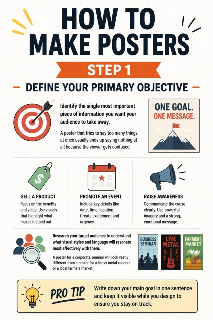
A poster that tries to say too many things at once usually ends up saying nothing at all because the viewer gets confused.
Ask yourself if you are trying to sell a product, promote an event, or simply raise awareness for a specific cause.
Research your target audience to understand what visual styles and language will resonate most effectively with them.
A poster for a corporate seminar will look vastly different from a poster for a heavy metal concert or a local farmers market.
Pro Tip: Write down your main goal in one sentence and keep it visible while you design to ensure you stay on track.
Step 2: Choose Your Dimensions And Orientation
Determine where the poster will be displayed before you start placing any elements on your digital canvas.
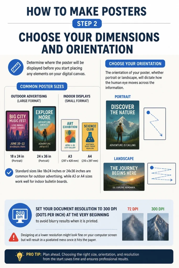
Standard sizes like 18×24 inches or 24×36 inches are common for outdoor advertising, while A3 or A4 sizes work well for indoor bulletin boards.
The orientation of your poster, whether portrait or landscape, will dictate how the human eye moves across the information.
Set your document resolution to 300 DPI (dots per inch) at the very beginning to avoid blurry results when it is printed.
Designing at a lower resolution might look fine on your computer screen but will result in a pixelated mess once it hits the paper.
Step 3: Create A Strong Visual Hierarchy
Arrange your elements so that the most important information is the largest and most prominent on the page.
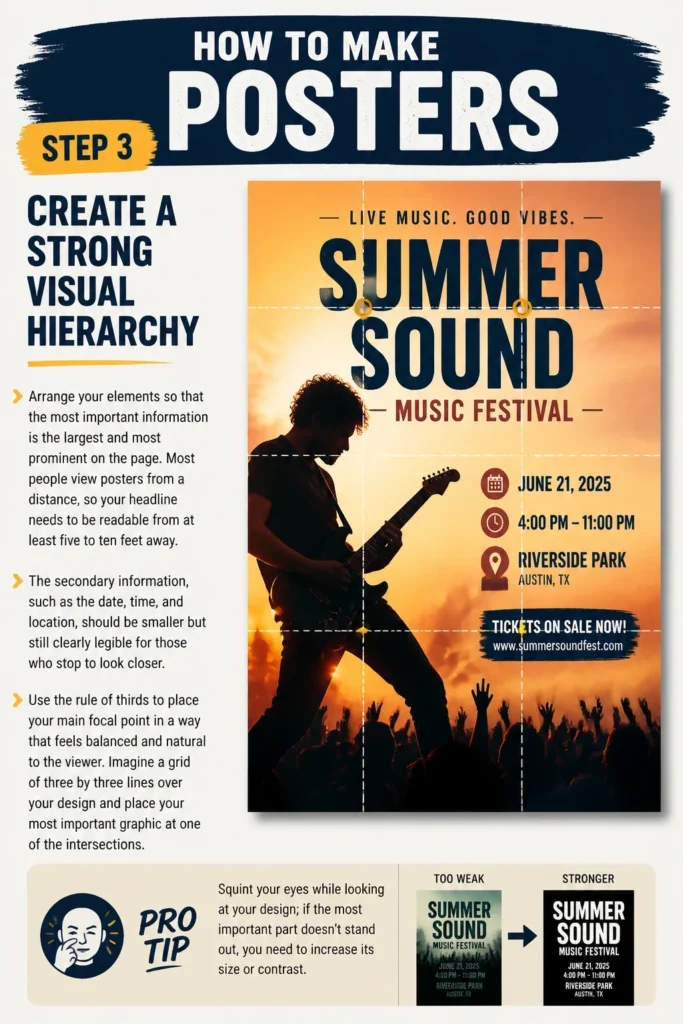
Most people view posters from a distance, so your headline needs to be readable from at least five to ten feet away.
The secondary information, such as the date, time, and location, should be smaller but still clearly legible for those who stop to look closer.
Use the rule of thirds to place your main focal point in a way that feels balanced and natural to the viewer.
Imagine a grid of three by three lines over your design and place your most important graphic at one of the intersections.
Pro Tip: Squint your eyes while looking at your design; if the most important part doesn’t stand out, you need to increase its size or contrast.
Step 4: Select A Striking Color Palette
Limit your color choices to two or three main colors to keep the design looking professional and cohesive.
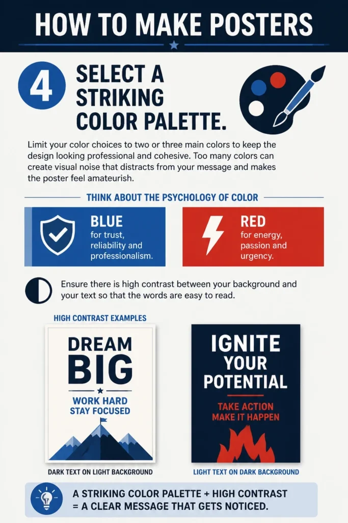
Too many colors can create visual noise that distracts from your message and makes the poster feel amateurish.
Think about the psychology of color, such as using blue for trust and professionalism or red for energy and urgency.
Ensure there is high contrast between your background and your text so that the words are easy to read.
Dark text on a light background is the most traditional choice, but light text on a dark background can create a very modern and bold look.
Step 5: Pick Readable Typography
Select fonts that match the mood of your message while prioritizing clarity over decorative flair.
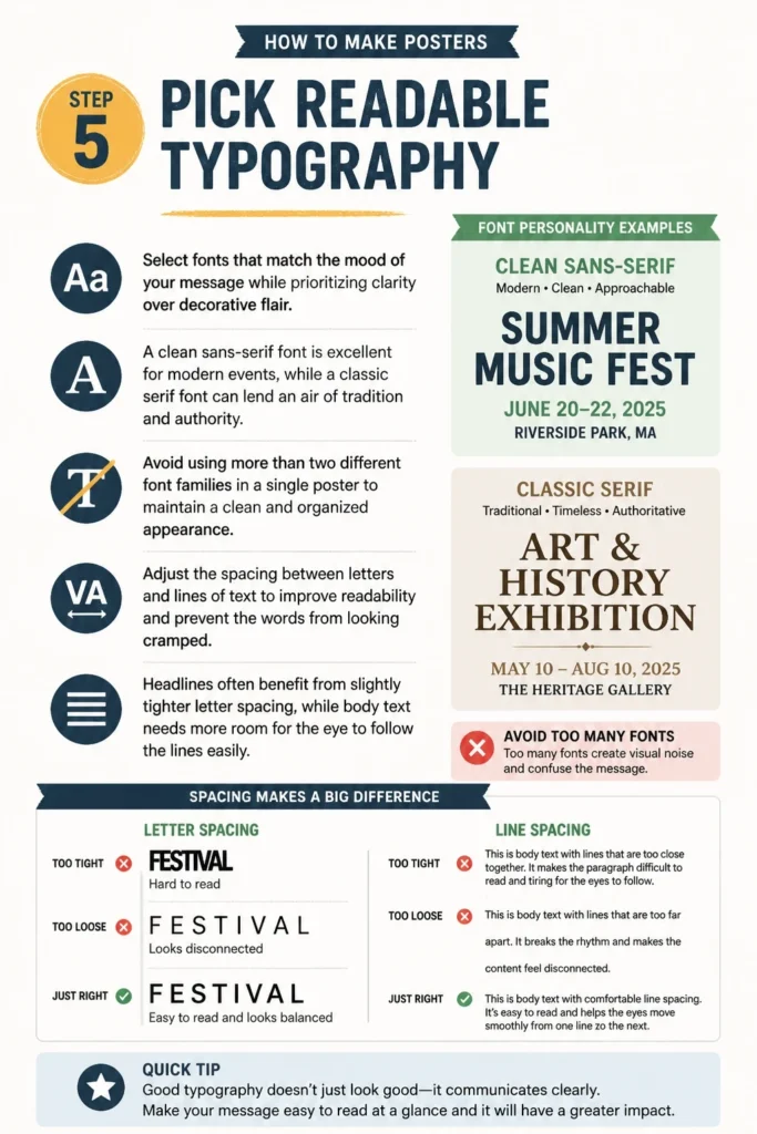
A clean sans-serif font is excellent for modern events, while a classic serif font can lend an air of tradition and authority.
Avoid using more than two different font families in a single poster to maintain a clean and organized appearance.
Adjust the spacing between letters and lines of text to improve readability and prevent the words from looking cramped.
Headlines often benefit from slightly tighter letter spacing, while body text needs more room for the eye to follow the lines easily.
Step 6: Source High Quality Visuals
Use original photography or high-quality stock images that relate directly to your core message.
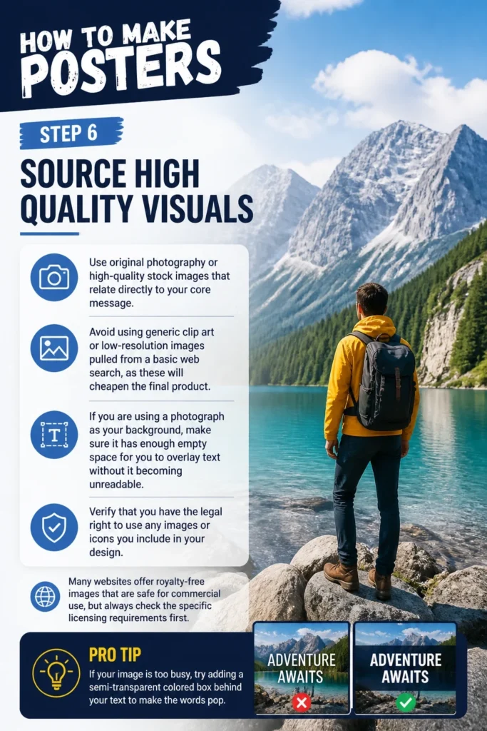
Avoid using generic clip art or low-resolution images pulled from a basic web search, as these will cheapen the final product.
If you are using a photograph as your background, make sure it has enough empty space for you to overlay text without it becoming unreadable.
Verify that you have the legal right to use any images or icons you include in your design.
Many websites offer royalty-free images that are safe for commercial use, but always check the specific licensing requirements first.
Pro Tip: If your image is too busy, try adding a semi-transparent colored box behind your text to make the words pop.
Step 7: Balance Elements With White Space
Leave plenty of “white space” or negative space around your text and images to give the design room to breathe.
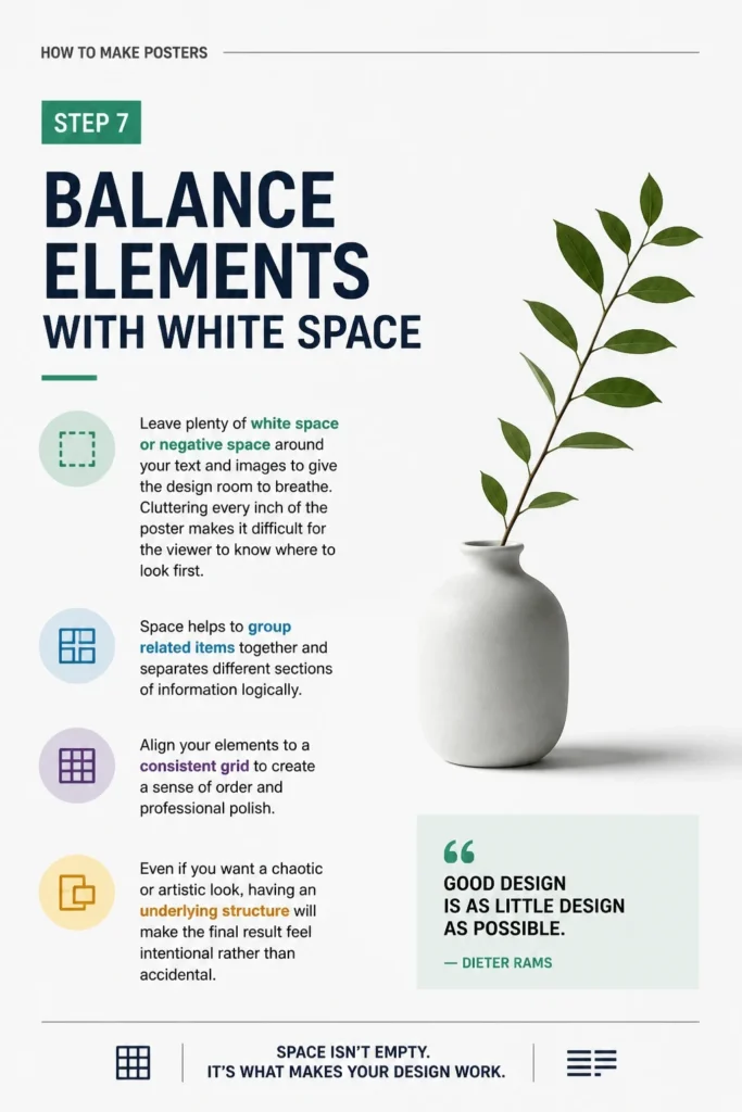
Cluttering every inch of the poster makes it difficult for the viewer to know where to look first.
Space helps to group related items together and separates different sections of information logically.
Align your elements to a consistent grid to create a sense of order and professional polish.
Even if you want a chaotic or artistic look, having an underlying structure will make the final result feel intentional rather than accidental.
Step 8: Include A Specific Call To Action
Tell your audience exactly what you want them to do after they finish reading your poster.
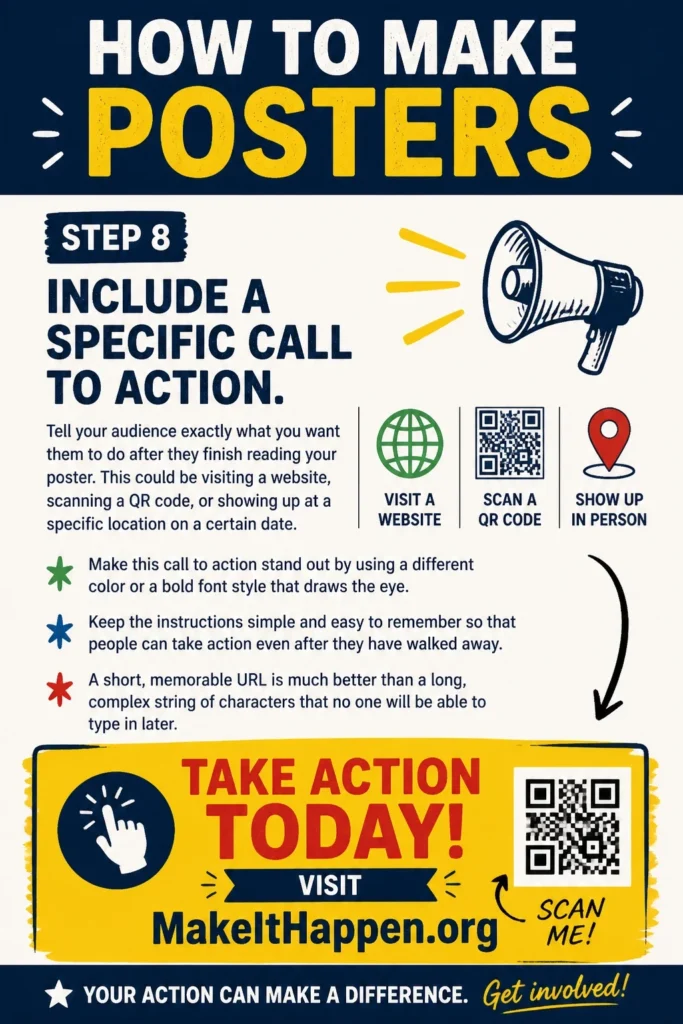
This could be visiting a website, scanning a QR code, or showing up at a specific location on a certain date.
Make this call to action stand out by using a different color or a bold font style that draws the eye.
Keep the instructions simple and easy to remember so that people can take action even after they have walked away.
A short, memorable URL is much better than a long, complex string of characters that no one will be able to type in later.
Step 9: Proofread And Check Margins
Check every single word for spelling and grammar mistakes, as a typo can ruin the credibility of your entire project.
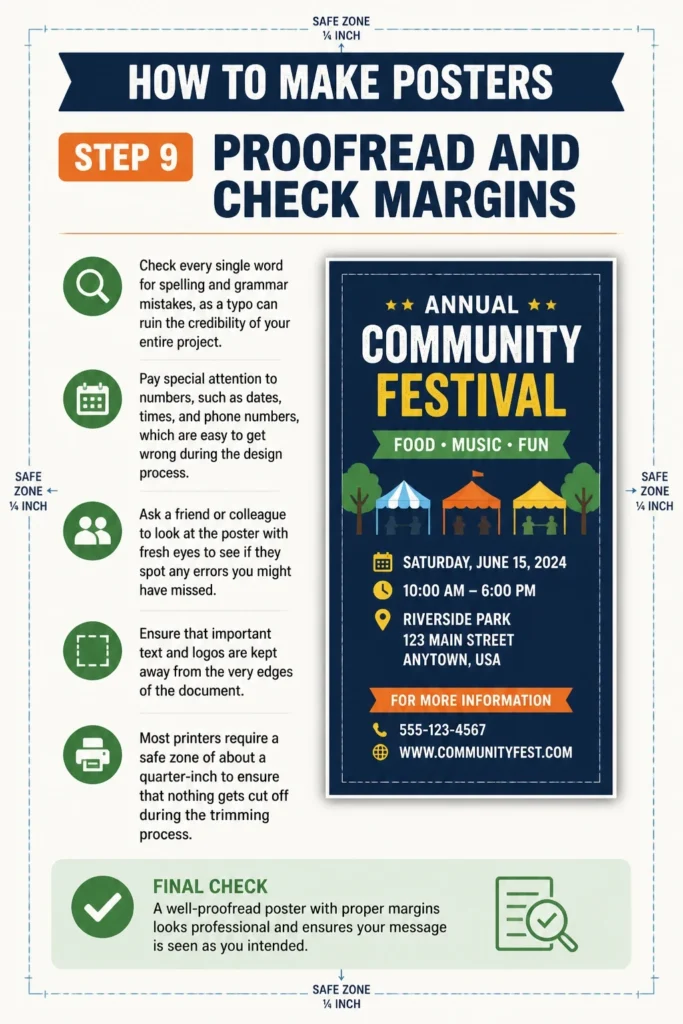
Pay special attention to numbers, such as dates, times, and phone numbers, which are easy to get wrong during the design process.
Ask a friend or colleague to look at the poster with fresh eyes to see if they spot any errors you might have missed.
Ensure that important text and logos are kept away from the very edges of the document.
Most printers require a “safe zone” of about a quarter-inch to ensure that nothing gets cut off during the trimming process.
Step 10: Export For High Quality Printing
Save your final design as a high-resolution PDF, which is the industry standard for professional printing.
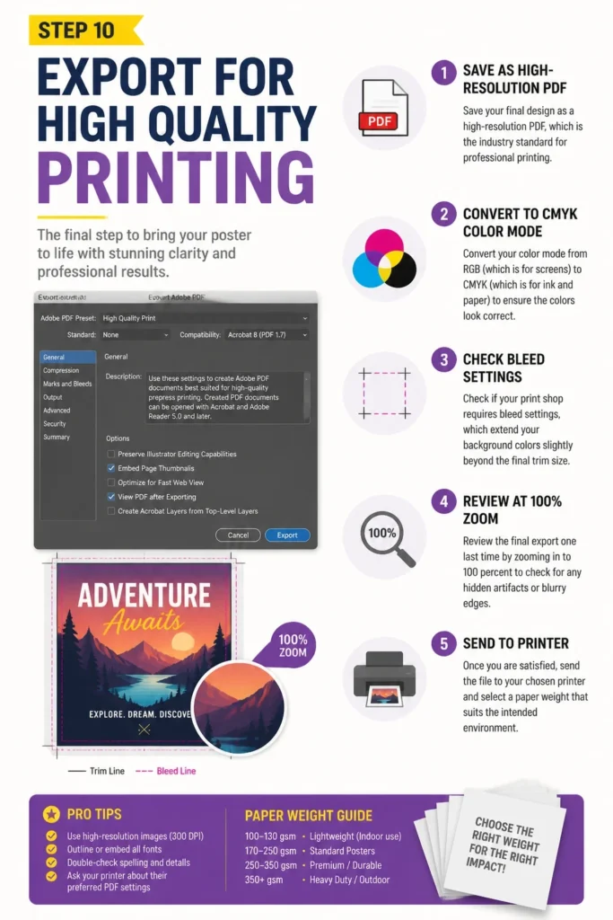
Convert your color mode from RGB (which is for screens) to CMYK (which is for ink and paper) to ensure the colors look correct.
Check if your print shop requires “bleed” settings, which extend your background colors slightly beyond the final trim size.
Review the final export one last time by zooming in to 100 percent to check for any hidden artifacts or blurry edges.
Once you are satisfied, send the file to your chosen printer and select a paper weight that suits the intended environment.
Common Mistakes to Avoid
Overcomplicating The Design
Many beginners try to fill every corner of the poster with decorations, patterns, and extra text. This creates a messy look that makes it hard for the viewer to find the most important information quickly. A clean design with a single focal point is almost always more effective than a busy one.
Ignoring Visual Contrast
Using colors that are too similar in tone will make your text disappear into the background. For example, light gray text on a white background is nearly impossible to read from a distance. Always test your color choices by looking at them from across the room to ensure they remain distinct.
Using Low Resolution Graphics
Grabbing a small image from a website and stretching it to fit a large poster will result in a blurry or blocky appearance. This is one of the most common signs of a poorly made poster. Always start with the largest possible image files to maintain sharpness and detail in the final print.
Troubleshooting
Text Getting Cut Off During Printing
If your text is too close to the edge of the page, the physical cutting process at the print shop might slice through your words. To fix this, move all your important content at least 0.25 inches away from the edge of the canvas. This area is known as the safety margin and protects your design from minor alignment shifts in the printer.
Colors Looking Dull In Real Life
The colors on your glowing computer screen often look brighter than they do when printed on matte paper. This happens because screens use light (RGB) while printers use ink (CMYK). You can minimize this issue by converting your file to CMYK early in the process and choosing a glossy paper finish if you want the colors to pop.
The Poster Feels Unbalanced
If your poster feels “heavy” on one side, it is likely because you have placed too many large elements in one area. Try moving your main image or headline to a more central location or adding a smaller element on the opposite side to create visual weight. Using a grid system will help you see where the gaps are and how to fill them more effectively.
Key Takeaways
- Start with a single clear goal to keep your design focused and effective.
- Use a 300 DPI resolution to ensure your final print is sharp and professional.
- Create a visual hierarchy by making the most important information the largest.
- Limit your color and font choices to avoid a cluttered and confusing appearance.
- Leave enough white space to allow the viewer to process the information easily.
- Always proofread your text and check your margins before sending the file to print.
Frequently Asked Questions
What is the best software for making posters?
Professional designers often use Adobe Illustrator or Photoshop for maximum control and high-quality output. However, beginners can get great results using user-friendly web tools like Canva or even basic layout programs like Microsoft Publisher. The best tool is the one that you feel comfortable using while still allowing you to export high-resolution files.
What size is a standard poster?
The most common sizes for posters are 11×17 inches (small), 18×24 inches (medium), and 24×36 inches (large). In many parts of the world, the A-series is used, with A3 being a popular choice for indoor notices and A2 or A1 for larger displays. Always check where you plan to hang the poster before choosing your final dimensions.
How do I choose the right paper finish?
A matte finish is excellent for posters that will be displayed in brightly lit areas because it does not reflect light and is easy to read from any angle. A glossy finish makes colors look more vibrant and saturated, which is perfect for photographic posters or movie advertisements. For a premium feel, consider a semi-gloss or satin finish that offers a balance between the two.
Can I make a poster in Microsoft Word?
While it is possible to make a poster in Word, it is not the ideal tool because it lacks advanced layout and color management features. If you must use Word, make sure to set your page size correctly from the start and save the final document as a PDF to preserve your formatting. You may find it more difficult to position images and text exactly where you want them compared to dedicated design software.
Our Top Recommended Finds
- Graphic Design Software: A subscription to a professional design suite or a high-quality free alternative will give you the tools needed for advanced layouts.
- Heavyweight Cardstock: If you are printing at home, using a thicker paper stock will prevent your poster from wrinkling and give it a more durable feel.
- Self-Healing Cutting Mat: This is a vital tool if you need to trim your posters down to size by hand using a craft knife and a straight edge.
Put Your Design Into The World
Now that you have the foundational steps for creating a professional poster, it is time to start your first project.
Begin by sketching your ideas on a piece of scrap paper before you even touch your computer.
Once you have finished your first design, consider learning more about color theory or advanced typography to further improve your skills.
Take the leap and print your creation today to see how your digital work translates into a physical piece of art.